Making The Most Of Flexo Printed Packaging
Flexo Box Printing
Flexo printing is widely used for printing corrugated shipping boxes, postal boxes, eCommerce boxes, pizza boxes and paper bags. This was once the most commonly used printing method within the corrugated industry and it’s still a popular choice today.
Cost effective printing, does of course have limitations and isn’t going to give you the same results as digital or litho printing, so it’s important you know what to expect and how your finished printed corrugated packaging could look.
The artwork you choose to brand your shipping box or mailer, can make or break the finished result. Our experienced team wants to ensure you get the best possible results for your branded packaging and will work with you to achieve this.
Top Tips for your Graphic Designer
Some bold and striking results can be achieved on your printed packaging. Here are some simple do’s and don’ts’ for your graphic designer:
Do
- Stick to 1-3 colours
- Design in pantone colours
- Use block colours
- Create bold eye catching designs
- Consider whether white or Kraft paper is the best base for your design
- Consider what effect any registration shift could have on your design
- Consider where colour trapping/shadowing may occur
- Read our artwork guidelines below
Don’t
- Design in CMYK
- Create complex artwork more suited to digital or litho
- Use too many colours close together
- Use a condensed or particularly fine text line weight
- Have lots of text or patterns too close together in different colours
Flexo Printing At It’s Best
Jam n Vegan – A delivery box packed full of information & intricate design elements
What makes this work?
A 1 colour design, needs only 1 printing plate, this negates any visible registration shift & keeps elements of the design from colliding
There is no trapping/shadowing caused by overlapping colours
Using white paper instead of Kraft, allows vibrant colours and details to stand out
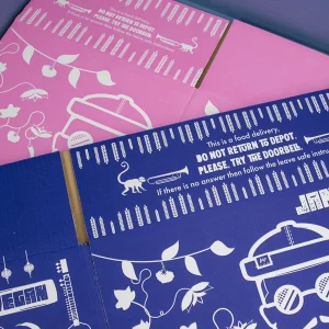
O’Donnell Moonshine. A stunning gift box, printed in just 1 colour!
What Makes this Work?
1 Colour artwork – the lighter tones of black are achieved by printing tiny dots spaced further apart to give the appearance of being a lighter shade. This is called screening or halftoning.
Using the Kraft paper for this box really fits the brand image and adds to the overall print design.
The Black Farmer: A shipping box that uses halftoning to create a stunning photographic visual
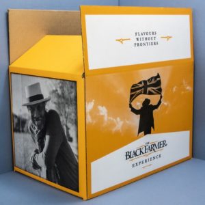
It’s incredible to think this is a shipping box printed in just two colours! This artwork adopts lots of halftoning to achieve the design.
Here’s what it looks like close up:
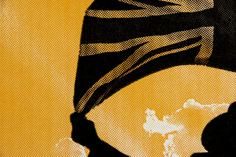
What is Screening / Halftoning
Halftone screening is a technique used to fool the eye into seeing tones and colours that are not actually present. The corrugated industry prints halftones to create more complex looking artwork (like The Black Farmer shipping boxes) creating lighter tones and colour gradients.
Below you can see how the density of the dots creates a different shade of black:
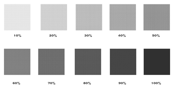
It’s important to note that different machines will produce different results. This can be discussed in more detail before printing.
So what can go wrong with Flexo printed packaging?
It’s not so much about what can go wrong, but more about what can occur during the process of flexo printing your boxes and corrugated packaging.
It’s important that the following points are considered when designing your artwork. If the design is adapted for flexo printing, you will get the best possible results.
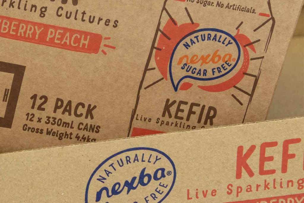
Nexba: 4 Colour Shipping Boxes & Trays
These printed shipping boxes & trays made for Nexba look fantastic, but if you look closely at the blue and orange logo, you can see a slight overlap of the orange and blue text. The orange ‘Nexba’ has been printed 1-2mm lower than it’s correct position, which you can see in the blue logo on the tray below. This is called registration shift and can be a common occurrence during flexo printing.
More About Registration Shift (Print Movement)
Registration shifts can cause letters, words or patterns printed next to one another to overlap or misalign. When two colours overlap, this is referred to as trapping, shadowing or grip:
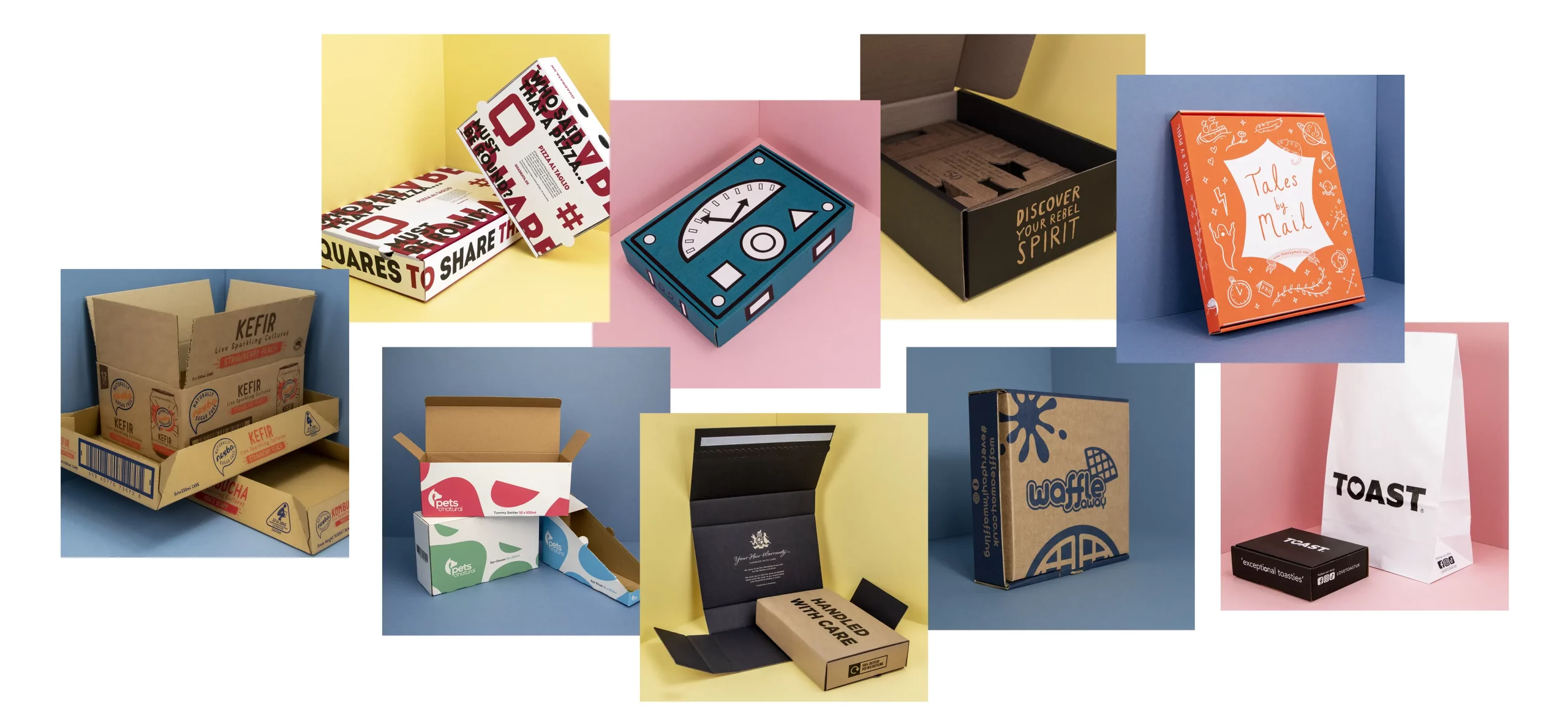
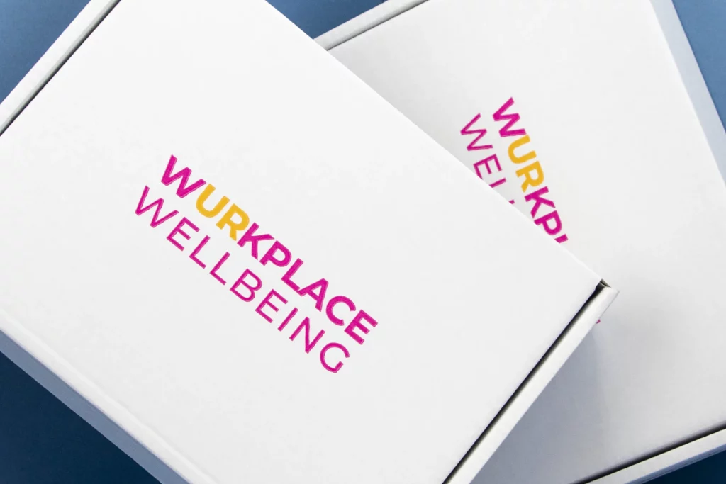
Wurkplace Wellbeing: Example of registration shift – The yellow print is 1-2mm out of line with the pink lettering. These boxes are printed within the industry tolerance. The visible shift could be avoided by printing the logo in 1 colour:
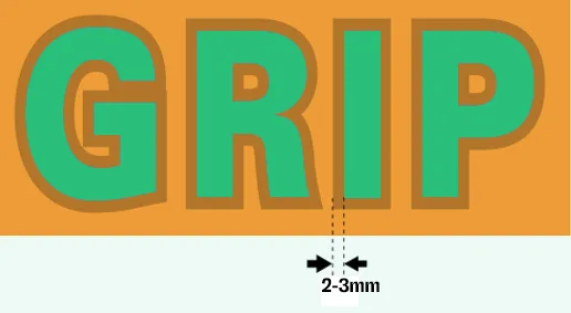
Trapping/Shadowing
When registration shifts happen it causes something called trapping or shadowing to occur. This is where two colours overlap creating a 3rd, unwanted colour and this can happen to varying degrees of visibility. Colour 1 and colour 2 can overlap by 2-3mm and be within industry tolerance:
Even when is no registration shift, a 3rd colour will usually be visible when laying two colours next to one another. This is what is referred to as colour grip. Colour grip also has a 2-3 mm industry tolerance:
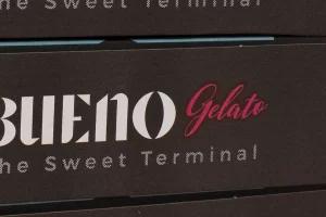
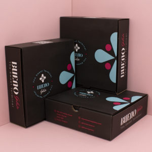
Bueno Gelato: Example of colour grip can be seen around the pink ‘Gelato’ text where it overlaps the black background underneath. This can be more visible on a lighter background:
To avoid any unwanted shadowing we recommend at least a 2-3mm ‘choke’ between colours. The wider the choke the less visible any print movement will be and the less likely any trapping will occur:
Printing White Text or Illustration
Printing white text or illustrations onto Kraft postal boxes or gift boxes can be notoriously troublesome with differing results.
Woven: Example of white printed onto Kraft
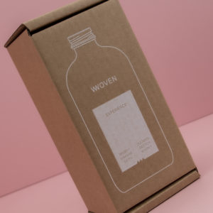
Printing white onto a Kraft background can result in a creamy white, rather than pure white.
You may get a visible background hue, this is called ‘pitting’ it’s where the ink doesn’t get into all the dimples in the slightly uneven surface of the cardboard.
You tend to see more ‘pitting’ when printing lighter colours like white. Pitting can be visible when printing onto testliner, printing onto Kraft paper can reduce this.
The best way to print a clean bright white onto a cardboard box is to start with a white paper. We can print any colour onto this, leaving the white of the paper as your text or graphics.
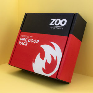
Zoo Solutions: Example of a 3 colour design, using only 2 colours (Black & Red) with the 3rd white colour being the surface of the box.
Bueno Gelato: Example of a 4 colour design, using only 3 ink colours (Black, blue & pink) with the 4th white colour being the surface area of the box.
Here you can also see the light blue and pink colours have not been diluted like they would have, printed onto Kraft.
Colour Matching
Flexo printing uses pantone colour instead of CMYK. Printed pantone colours will vary depending on the substrate printed onto. Here are some examples of the same pantone colour, printed onto different substrates. You can see how the same colour printed onto brown testliner paper and brown Kraft paper, looks quite different to the original colour, printed onto white:
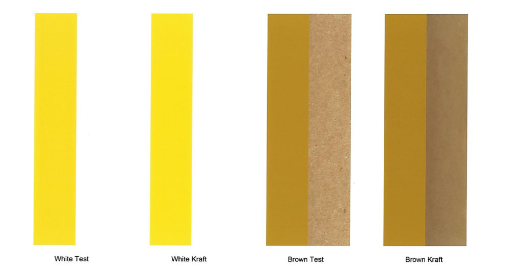
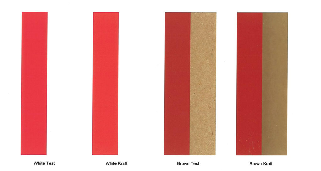
We always print to the pantone you provided on your artwork, but it’s important to be aware of how it may look different, particularly on a Kraft cardboard box. Test swatches are available from us on request.
Artwork Guidelines & Format
For the process to go as smoothly and quickly as possible, we will send you a cutter guide to lay your artwork to. Your graphic designer should follow the below guidelines when applying your artwork to this:
- Ensure artwork is laid to the correct view / print face (i.e. outside or inside)
- Leave at least at 5mm gap (die cut designs) or 10mm gap (standard cases) between the print and edge and case or crease
- If the print is solid then it must bleed off the edges by 10mm and avoid glueing areas
- Note: Any print that runs off the panel edges / flaps will not line up exactly when the box is made up
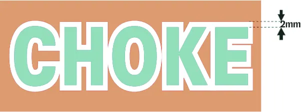
- Leave at least a 2mm choke between colours to avoid visible registration shift or grip
- Minimum recommended font line size 1mm plus
- Bar Code recommendations can vary, please ask us for further details on this if printing a bar code
- QR Codes should be printed to a minimum size of 38mm
- Bar codes & QR codes should always be printed in dark colours
- Photographic images should be supplied in 300 lpi and as individual EPS files
- All fonts must be included
- Use a bold font for negative text, avoiding condensed / narrow fonts
- Supplied format can be Adobe Illustrator (Vector format), Photoshop, Artpro, High Res PDF
Once your artwork has been submitted and your order placed, a print manager will check the artwork and you will be advised if changes are recommended. A final digital proof will be sent back to you for checking / approval before we proceed.
Wet Proofs
Wet proofs are not standard practice, but we can produce these if requested. Your account manager will raise you a quote for wet proofs once we have received your completed artwork.
Stereo Costs
A ‘Stereo’ is needed for each colour you want to print onto your packaging. The cost of the stereo(s) will depend on:
- How many colours
- Print area
- Box size
Unfortunately we are unable to provide a cost for the printing stereo until we have seen your artwork and assessed the above information.
A stereo is only charged for your first production run, the same stereo(s) can be used over and over again for each subsequent run.