Packaging Psychology: How Colour Theory in Packaging Affects Consumer Behaviour
Colour can say a lot about your brand without you having to say or type a single word. Think about the last time you walked down the aisles of a supermarket. The chances are that the first thing you notice about a brand is its packaging, most notably the colour. It’s widely cited that people decide within 90 seconds of seeing your product, and between 62 – 90% of purchases are made on colour alone.
Colourful packaging doesn’t just make your product look pretty but can play a huge part in your brand’s success and influence a whole host of behaviours, including impulse buying and flavour perception.
Ready to find out more? Read on to learn about the science behind colour theory in packaging and how to harness the power of your product.
Related: Can Good Packaging Increase Sales?
Why Is Colour So Important?
Packaging psychology is a big thing in today’s world. The brain is programmed to feel a certain way toward colours. For example, brighter hues are considered fun, black is sophisticated and red draws you in. On a subconscious level, your target audience is already forming opinions on your brand just by the appearance of your custom packaging.
Colour Can Make Customers More Likely to Buy
A study carried out in 2013 found that the appearance of your packaging can influence impulse buying, even to those not intending to make a purchase.
Results showed that the more attractive the packaging, the more active the part of the brain associated with impulsivity, and there was less activity in the areas responsible for reflective thought. Interestingly, attractive packaging also triggered reward responses, whereas unattractive options triggered more negative emotions.
The colour and overall appearance of your packaging can make your customer more likely to make an impulsive choice, bypass reflective thought and feel rewarded as a result of the purchase. Powerful, right?
Colours Tell Customers What to Expect
One of the important things to consider with packaging psychology is that colours can tell your customers about what’s inside before they engage with it.
A good example of this is with fruit sweets, and drinks. Often, you’ll find that the product’s exterior reflects the fruit’s colour. If you pick up a red bottle, you’ll expect a strawberry drink. Yellow, you’ll hope to find lemon, and so on.
Customers also associate specific colours with flavours of crisps, and you’ll likely be familiar with the cheese and onion and salt and vinegar debate. Most brands follow the colour conventions of blue = salt and vinegar and green = cheese and onion. However, Walkers are among the few brands that don’t follow this expectation and have the two flavours switched around.
This has caused a bit of dispute, and according to a YouGov survey conducted in 2014, 44% of individuals believed that cheese and onion should be green, 30% suggested blue, and 10% said yellow. However, 48% said blue was the correct colour, and 32% thought green.
If you’re wondering why this matters, it’s been found that colour can enhance consumers’ taste expectations and overall expected liking of a product. Research on cheeses discovered that people associated lighter colours with more mellow flavours, whereas deeper hues suggested a sharper, bolder taste.
Think about the packaging for a spicy product such as Pot Noodle’s Bombay Badboy. It’s primarily black with hints of bright red and yellow. The chances are your tastebuds will be anticipating spice before you even stick a fork in.
You’ll need to remember your target audience’s nationality if you play on taste expectations, as this can vary culturally. For example, Malaysia considers orange sour, but the USA and UK would expect sweeter flavours.
Do your research if you’re using colourful packaging to market food. You’ll be surprised at what a difference it can make.
Related: A Guide to Shelf-Ready Packaging: Boosting Sales for Retail Products
The Colour Wheel of Packaging
Now you know why colourful packaging is so important, it’s time to dive into the feelings that colours invoke:
Colour |
Feelings |
| Blue |
trust, logic, intelligence, dependability, efficiency, calm.
|
| Red |
passion, love, excitement, strength, youthfulness.
|
| Green |
soothing, peaceful, balanced, fresh, healthy, sustainable, and harmonious.
|
| Yellow |
cheerfulness, optimism, warmth.
|
| Orange |
friendliness, cheerfulness, cost-effectiveness, boldness, confidence, and warmth.
|
| Purple |
creativity, imagination, spirituality, luxury, indulgence, nobility.
|
| Pink |
femininity, beauty, youthfulness, playfulness.
|
| Turquoise |
calm, pure, serenity.
|
| Brown |
earth, comfort, nature.
|
| Black |
elegance, premium, authority.
|
| White |
purity, innocence, goodness, humility, clean, premium.
|
| Grey |
neutral, calm, balanced.
|
Picking the Right Colour for Your Brand
Getting the packaging psychology right for your brand is a big responsibility, and it’s important you get it right.
Consider Your Brand’s Image
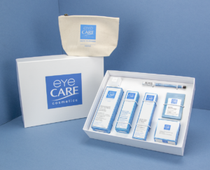
Your first step should be considering your brand’s image and how you want to communicate with your customers. Do you want to seem professional? If so, blue may be a good choice. Or maybe you want to emanate elegance? Then black or white may be the sophisticated option you’re after. Colour should reinforce your brand’s identity.
We use green branding to showcase our commitment to sustainability and the environment. However, if you’re selling a spa product, you may want to opt for lavender or light blue folding cartons to emit freshness. Whereas, if you specialise in hiking clothing, printed bags in shades of greens and browns to promote a connection to nature could be a good bet.
Think About Your Target Audience
Aside from thinking about how you want your brand to be portrayed, consider the preferences of your target audience. Where favourite colours are subjective to individuals, a study suggests that blue is preferred among men and women.
This was mainly due to the positive associations surrounding the colour, such as clean water, clear skies, and tranquillity. Furthermore, green and red were found to be the top favourite colours. However, purple was only a favourite among women, with more men disliking it.
If you’re wondering where the colour pink lies, it’s considered a variation of red, but the preferred variation of the colour varies among genders. It was found that women favoured soft tints of red, such as pink, whereas men preferred brighter shades, like ruby red. Interestingly, the reason behind this is much more scientific than you’d expect, and it may have to do with the fact that women see more differentiations of colours from men.
With this in mind, if your target audience is primarily women, you may want to choose softer, more muted shades and darker, punchier shades for men.
Look At Competitor Packaging
Don’t forget to look at the packaging of your competitors, too. Just because they’ve gone for a specific hue, it doesn’t mean you have to copy it. Instead, you could use this angle to your benefit and choose a different colour. Specific colours like red, yellow, green, and pink are some of the most eye-catching, but if every brand in your space uses the same shade, you’ll need to try something different to stand out.
Don’t feel limited to choosing just one colour. You can use another to bring out the primary colour or highlight it.
Related: Packaging Design: Make Your Products Fly off the Shelves
Custom Colourful Packaging for Your Business
Ready to make sure all eyes are on your product? Take a look at our range of custom packaging options, including rigid boxes, corrugated printed boxes and branded eCommerce packs. Everything is made from responsibly sourced materials and non-toxic, water or vegetable-based inks that are good for the environment and really make your product pop.
When you choose Packaging Supplies as your trusted partner, not only will you be receiving our incredible expertise in packaging design, but you’ll also get our top-notch printing services to ensure the highest possible quality.
Set your vision in motion, command your customer’s attention today, and get a free packaging quote in just 48 hours!